UX Design Unplugged with Taylor Ling
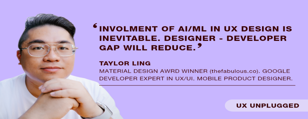
Taylor Ling is the co-founder of the ‘Fabulous’ app, which won Google’s Material Design Award for Most Charming Engagement. In his own words, Taylor Ling is a “Google Developer Expert in UX/UI and a Mobile Product Designer.” Ling values giving back to the broader UX design community and spends quite some time motivating designs and others to keep looking and not settle. Not just that, Ling is a frequent speaker at Android conferences. Also, he has spoken in the events in various locations like Turin, Bangkok, Vietnam, Paris, London, and Kuala Lumpur.
Ling spoke to us and shared his views on Material Design as well as about the ‘Fabulous’ app.
Excerpts from the Interview
How did you come up with the idea about The Fabulous app? How and when did you decide it was time to build a product?
The Fabulous app idea came from our co-founder and CEO, Sami. He thinks that there must be a way to help people achieve better selves, and he made it his life goal. He first started with another co-founder, Amine, who takes care of the technical side of Fabulous. I joined them as the third co-founder, taking care of the design side.
It was after a few idea pitching sessions, and we decided to make the product a reality. It’s always hard to gauge the effectiveness without having the real product used by the actual users.
What about before ‘The Fabulous’ happened? Could you tell us about how you got into design in the first place and your journey from there on?
The design was always my hobby before I did it professionally. I studied Biomedical Engineering, which requires me to explore problems with analytical thinking, and that helped a lot in my journey of becoming a designer. It wasn’t until I worked as a Functional Analyst cum UI designer; I realized that I am passionate about design. I started by being active with the Android Design community (back then in Google+), started my own Android Design blog (androiduiux.com) and things just grew from there.
Back to The Fabulous, how did you zero in on the primary feature set? How did you decide what to build first, what to park, and what to leave out?
Most of the time, it depends on the goal that we want to achieve in a defined period. There are always ideas coming in, and it’s impossible to build them all given the team size, and also lack supporting data. We always look for a feature having a significant impact on the users as well as on us. But at the same time, we continue polishing the existing experience to make it better every day. One way to approach a prominent feature for us is that we always treat it as an MVP. We started with a list of components, split them into phases, and started with the base which will then keep iterate after the release of the MVP. But of course, our MVP is of high quality and still feels polished. However, it may lack some infrequently used features until we continue working on them in the next few phases.
The Fabulous feels decidedly human. What was your method or way of finding a voice for The Fabulous?
When we first started with Fabulous, we know that the only way that it could work, in terms of the voice or language tone, is to have it as human as possible. We don’t call it an app, but as a companion, so it has to feel like a real human companion. That’s why we always try our best to include the ‘human’ element in the product, not just the copies, but also the design, the content, etc.
How and when did you decide to go with Material Design for The Fabulous? What was the thought process behind the decision?
I wrote about it here: https://android.jlelse.eu/the-fabulous-goes-material-26984c6a5b6c When Material Design was introduced back in 2014 at Google I/O, I knew that it’s a calling for us to have a redesign using Material Design. The original UI wasn’t the most efficient for us to deliver our vision, and this is when we decided to go forward with the redesign. It took us quite some time since it was a small team with around 4–5 persons.
In hindsight, going with Material Design has turned out amazingly well for The Fabulous. But what were the challenges that you faced working with Material Design? Things that didn’t go according to plan design-wise?
Material Design is beautiful, and it was a delighting experience to redesign the app using the design language. The main challenge is to ensure the whole experience is still the best while making sure that the UI and UX are matching the standard set in the Material Design guideline. So it feels like home for the Android users. Sometimes things don’t go as planned — and mainly (and as usual), it’s about prioritizing the design details that can take time to implement. We have to make sure that we are shipping the product with a unique design so we can continue building new features, which is crucial for a young startup.
What advice would you give to UX designers who want to use Material Design for their apps?
Study the entire Material Design guideline to observe and understand the beauty of Material Design, then look at all the beautiful Material Design apps to get inspiration, and adapt it to the product.
As a designer, what impending change do you see in the design industry that nobody is talking about?
There are a lot of impending changes, but luckily we are discussing most of them, with some of them coming sooner than expected. The involvement of AI/ML in design is inevitable; the gap between the designer and the developer will get closer and closer to produce a better product. Also, designing for different interfaces will become more common (e.g., VUI like Google Assistant, VR/AR content).
What are your thoughts on UX designers and agile? How can designers tackle the challenges they face while working in an agile process?
I thought agile is great for the designer! Obviously, it’s not the only way to work on a product, but in Fabulous, we always work in the agile process. There’s still a time that we fit in even if we already have a planned sprint, or we change some design details. While building it, we found some technical limitations or some better way to approach it. The end goal is simple — it creates the best product for our users.
As a design expert and writer, what is your superpower?
I think I am great at spotting typos ?. It’s something that’s not acceptable in my opinion, especially for a product that will be released publicly. Typos can create a wrong impression about the quality of the product and the team, even though the product is excellent.
And finally, I am a UX designer who is just starting. What advice would you give to people like me who want to do good work without losing out on creativity?
Always be clear of your goal in doing design work. As a designer, I fully understand that we want to create something brand new, sophisticated, and impressive. But at the end of the day, if this thing doesn’t really solve a problem, it means nothing to the user. Designer’s responsibility is always about creating a solution to tackle a real problem within constraints, not creating a piece of art.
You might also want to read: How to convince the client about UX?
I always remember these words from Google Design VP, Matias Duarte, and it’s still applicable in any situations:
“Design is all about finding solutions within constraints. If there were no constraints, it’s not design — it’s art.”
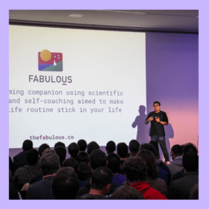
This great talk with Mr. Taylor Ling was constructive. Thank you so much, Mr. Taylor Ling, for having such a pleasant conversation and letting know us about The Fabulous app.

